
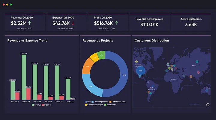
Data visualization is a crucial aspect of business intelligence, allowing companies to gain valuable insights from complex data sets. By visualizing data, companies can easily identify patterns, trends, and outliers, which can help them make informed business decisions. I have compiled a list of the top three data visualization tools to help you choose the best solution for your business needs.
Tableau
Tableau is a popular data visualization tool that is primarily built for this purpose. It offers drag-and-drop functionality and easy-to-use data blending, allowing users to combine different data sets for analysis. With Tableau, you can easily identify errors in your data and fix them quickly. It also provides a range of interactive user and server interfaces, making it easy to collaborate with other team members. Additionally, Tableau’s data preparation software is excellent, allowing users to handle large amounts of data and prepare it for visualization effectively.
While Tableau is an excellent data visualization tool, it is relatively expensive. The desktop and prep versions require a subscription, and you must pay per client user to access the server. Additionally, some functions, such as formatting options, can be challenging to locate. Tableau also lacks custom visual imports and only allows single-value parameters.
Power BI
Power BI is a popular data visualization tool from Microsoft that offers a wide range of custom visualizations. It can input data from several different types of sources and integrates well with Excel Power Query and Power Pivot. Power BI requires minimal coding and is easy to use for simple visualizations. However, it can be challenging to locate errors that are further back in your sequence, and fixing them can be difficult due to closely tied steps. Power BI is slower than Tableau and struggles to handle complex table relationships. Its user interface can also be crowded and rigid, and its DAX formulas can be challenging to use.
Despite these drawbacks, Power BI is very affordable, and a free version is available. Its range of custom visualizations is extensive, making it an excellent choice for businesses that require a specific type of visualization.
Zoho Analytics
Zoho Analytics is a cloud-based data visualization tool that offers a free version and is affordable compared to other options. It is easy to set up and input data to build reports, and it offers more integration options than Tableau or Power BI. Zoho Analytics also allows users to create custom reporting and dashboard options, and it integrates with other Zoho applications. It offers simi-private client links and affordable private client viewership.
However, Zoho Analytics can be challenging to configure initially, and editing graphs and charts can be difficult. Its A.I is lackluster, and it does not offer automation for running reports. Zoho Analytics can also be slow at times.
In addition to these three tools, other data visualization tools worth considering include JuiceBox, Qlik, Adaptive Insights, Dundas BI, Domo, Cluvio, Data Wrapper, and FusionCharts Suit XT. A
